Making fans from first time visiters with daily engagement and education
Designing a mobile app to help drive engagement on the website through use of a mobile app.
Read moreDesigning a new Homepage after launching the MVP product for Unikrn.
I was one of the first Employees hired by Unikrn and helped launch the initial MVP site. Our goal was to get that site up and running to test the viability of the market. Once this was done we decided we needed to optimize the site, focus on user acquisition, and retentions. For this project most of our focus was on the landing page and the sign up form.
We had a small 4 person team that located in Seattle and Berlin Germany. The German team lead development with one server side engineer, and one front end engineer. The Seattle team consisted of our Graphic Designer who handled asset creation and myself as Product Manager/ UX design.
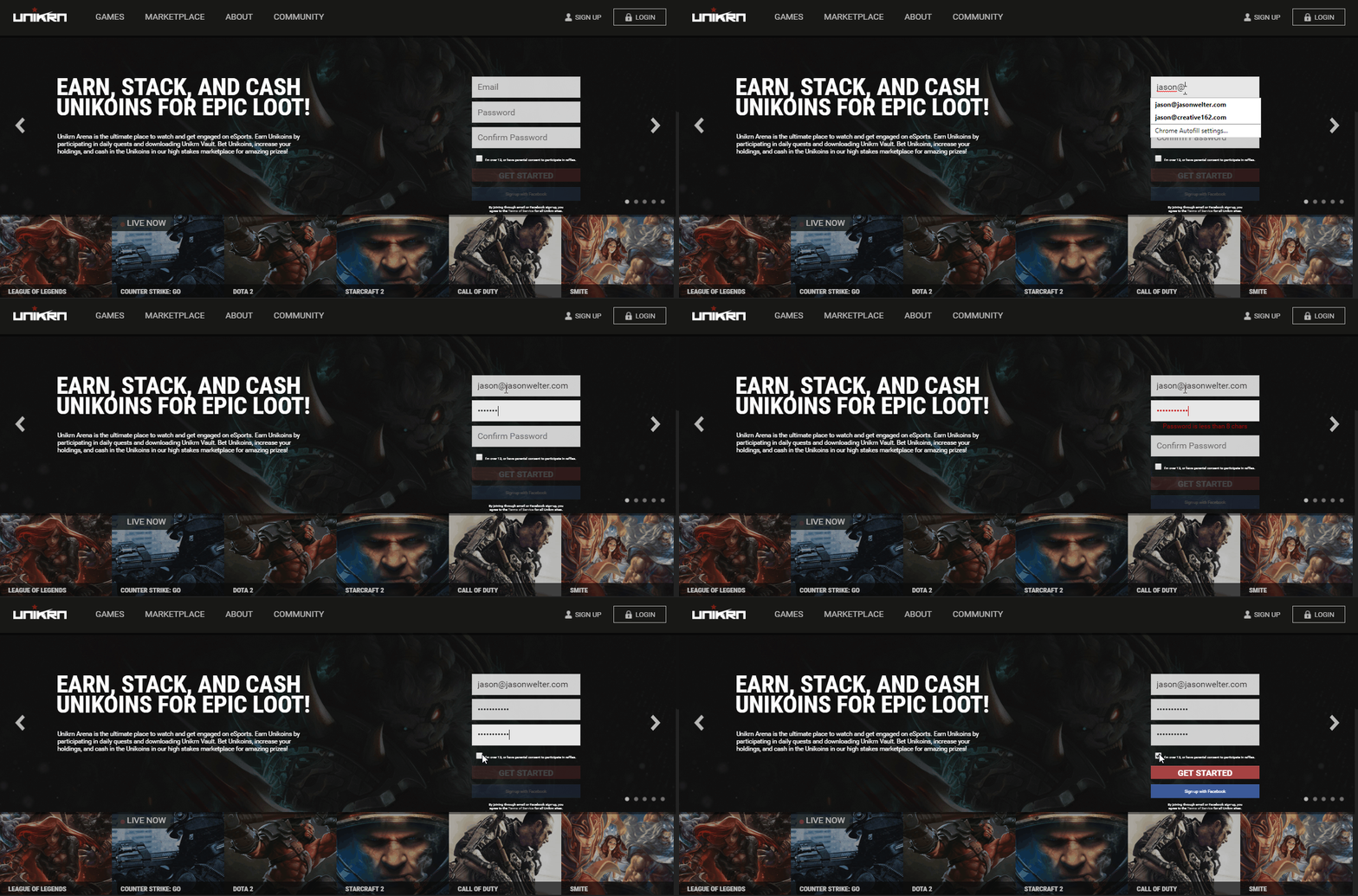
The signup funnel's original design had too many constraints based on user location and created an overly complex sign up form.
The betting lanscape is a foreign market to the US and being such the design has back somewhat lacking.
Of our new daily users, 80% would drop off from the signup form.
2% of our average users would return the next day, 4% would return after 1 week.
After launching the MVP we had around 20-30 active users per day.
Since I was targeting signups and user retention as the goal of this launch I decided to use these three metrics to validate my design choices. For new user acquisition I chose Signup Dropoff as to make sure users are getting past the first layer of the acquisition funnel.
For User Retention I wanted to focus on our return users. This way I know that users are enjoying the site and coming back to either place more bets or watch more of games.
To make sure I am not looking purely at one dimension for results I decided to use our number of Daily Users to validate both increasing our user base and returning users since this is a solid representation of both.
I am a big fan of Lean UX and I find it works great in smaller teams and startups to get all the gears moving. For this project I gathered all the stakeholders and went over the goals for the project and we discussed possible features, the value of each one, and the difficulty to impliment. This allowed me a good idea of where the best efforts could be made based on our timelines.
Using a combination of Facebook data, Google Analytics, and industry information, I was able to create an Persona of our target demographic
The gaming industry (especially esports,) tends to be a male dominated industry. In our case only 4% of our audience was female so the majority of our efforts would be spent creating a look and feel that would appeal to the male audience. Looking at facebook and Google Analytics I was able to see that the majority of our audience was in the 24-28 age range, which is exactly where we would want it to be for a betting platform.
Looking at the current competative landscape to get a better feel for what will and won't work. Gambling in eSports was still quite new and so I relied more on parallels such as DraftKings, Vulcun.com, alphaBet , and others for reference.
Many of the established betting sites such as Sportsbook.ag had very targeted signup funnels. One of the things that we didn't impliment in our initial MVP launch of Unikrn.com was a signup with Facebook option. This would allow us to get new users with the least amount of friction. This option wasn't all sunshine and rainbows, it does come with some constraints, such as you only get the email associated with the facebook account, in many cases these were throw away emails so adding a secondary email validation step after account creation was sometimes neccessary.
Once I have a good idea of our goals, target demographic, and a the competitive landscape I begin to sketch ideas and experiment with different options and features that best meet those goals. During this time I try to really focus on our target user and put myself in their shoes, what would they want, what would they expect the interface to do. I firmly believe the best way to improve your customers experience is through Empathy. You need to understand them before you can help them.
One of the launch features was the idea of customized quadrants. A user could come to Unikrn.com and customize how the homepage is laid out. The main reason for this is we noticed that our users were betting on specific Games, for example, User Steve would only bet on League of Legends games but not CS:GO games. This led me to believe that the majority of users would only bet on the games they liked to play. So when a user would set the upper left quandrant on unikrn to show League of Legends games, it would only show League of Legends games until changed. This way a user can customize how their homepage is laid out.
I try to get to testing my ideas as soon as possible, the faster we fail the faster we improve.

I began testing the signin dialog using HTML/CSS, Javascript, and Screen shots of the design comps. Once I have things in place I can test out flows and make sure it meets our users needs.
Once the designs have been implimented the real fun begins. In startups funds can be limited so I had to get really creative. Using the metrics defined earlier along with creating personas from Google Analytics I was able to look at how users are using the site and from that find their pain points.

In a startup you have to be very creative with resources. You may not have access to large testing environments, eye tracking software, or the ability to do large user studies to gather information. For this project I used a combination of Optimizely for AB testing, Google Analytics to validate my findings, Peek usability testing to get live analysis of users on the site, and my personal favorite, Hotjar to view a users journy through the website.
We went from 80% dropoff down to 25% on the signup form.
Our next day return users jumped up to 6% and our week over week return users spiked at 14% of new users would return.
We jumped from 20+ users a day to over 200+ over the span of a two months
The changes to the signup flow assisted greatly in getting new users onto the site before they bounced. This coupled with the customized homepage features were the first steps in streamlining and establishing a fanbase with Unikrn.com


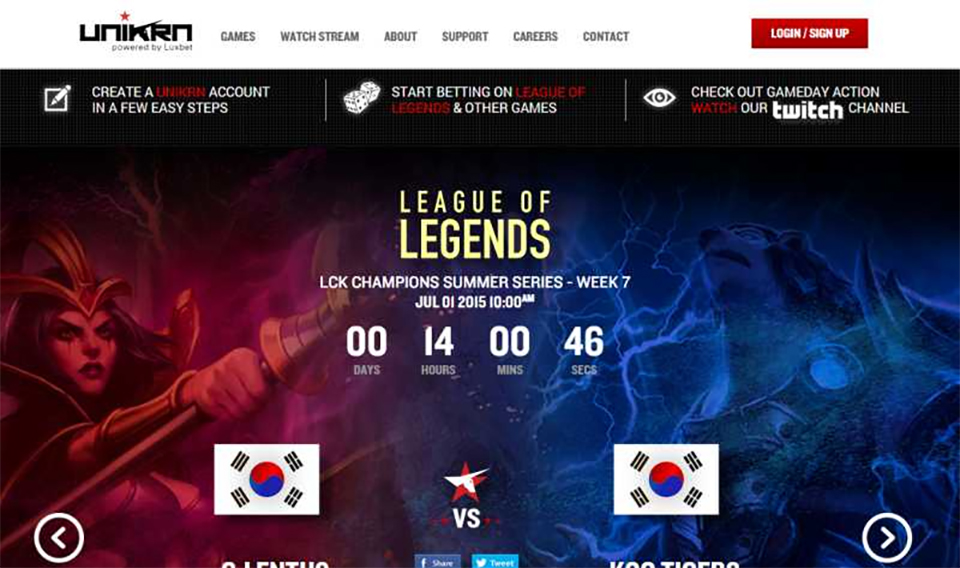
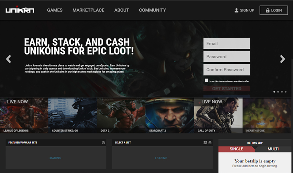
A comparison of the old site VS the new site's landing pages.